 Prism Inspector
Prism Inspector
Prism Inspector

Prism Inspector reads a running app — in the iOS Simulator or on an iPhone plugged into your Mac — and lets you work on it the way you work in a design tool: click an element to inspect it, ⌥-click a second one to measure the space between them, and see immediately when that space is not on your design system's scale.
macOS 13 or later · Apple silicon and Intel · Free · Signed with Developer ID and notarized by Apple
The same app, live: the simulator on the right, the inspector reading it on the left. Two rows selected, the gap measured at 42 pt — and flagged 42→40, because 42 is not on this project's spacing scale.
Everything below is a screenshot of the tool doing the thing, against a real app running in the simulator — so what you measure is what the app actually rendered, not a guess from a picture of it.
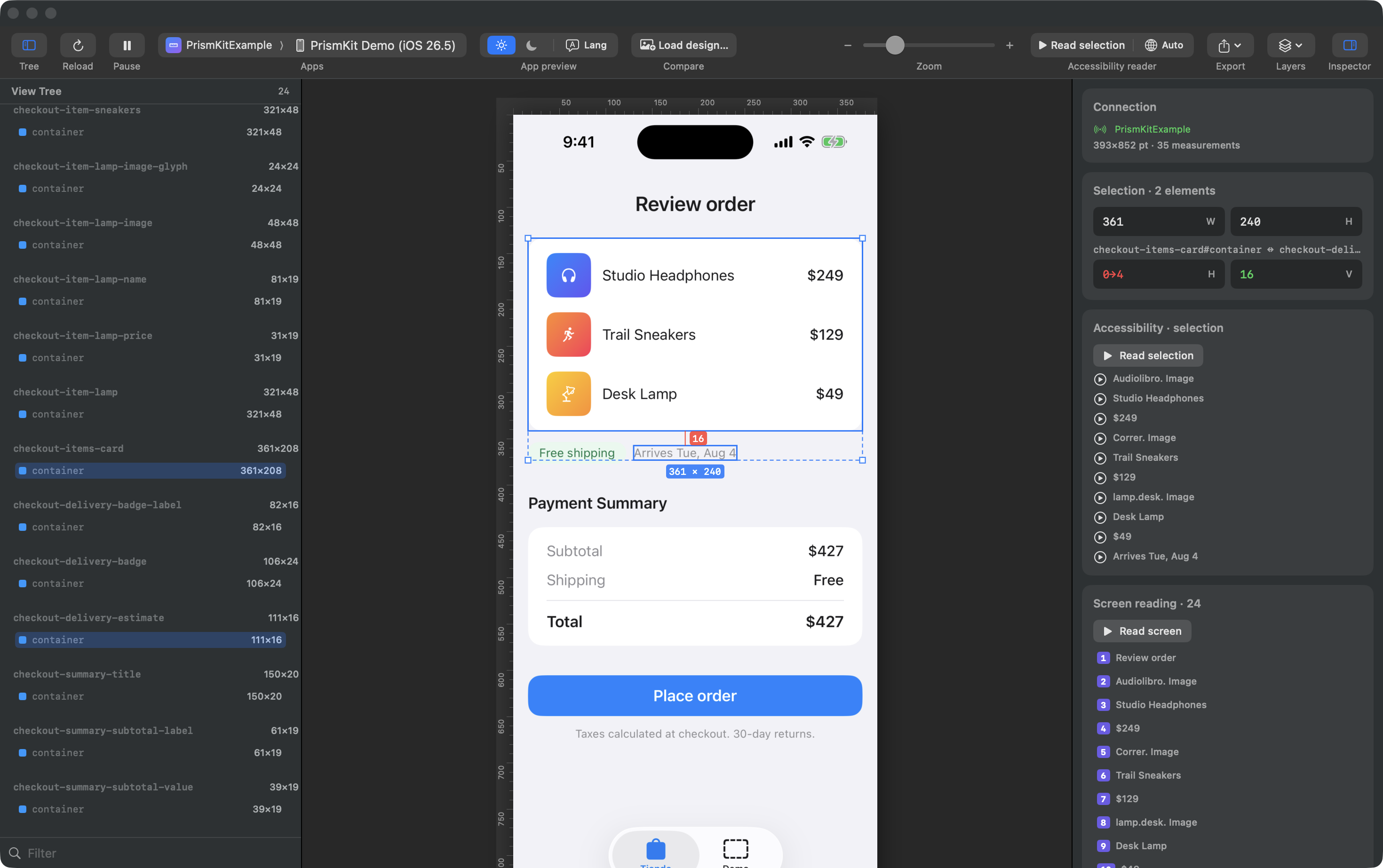
Click an element to select it. ⌥-click a second one to measure the space between them — the gap per axis, or the four insets when one contains the other.
Distances come from the layout the app actually produced, in points. Nothing is counted by eye off a screenshot.
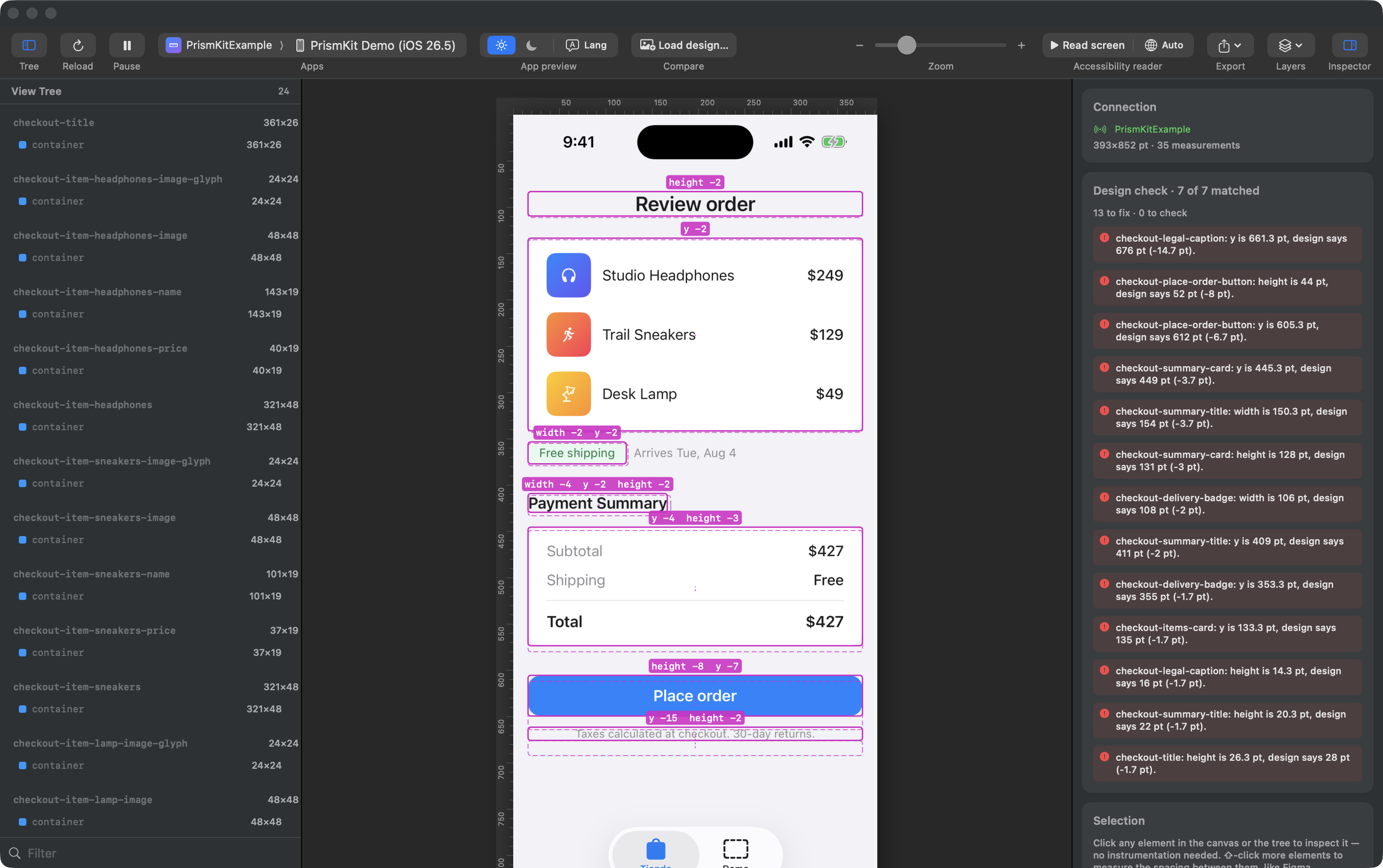
Attach a design and get a per-node report: what moved, what is the wrong size, what is missing. Expected positions are drawn straight onto the canvas, beside where the element actually landed.
When something has no match, the nearest unclaimed element is offered with it — because "it moved" and "it disappeared" look identical to a comparison that only matches by position, and only one of them is the bug you are looking for.
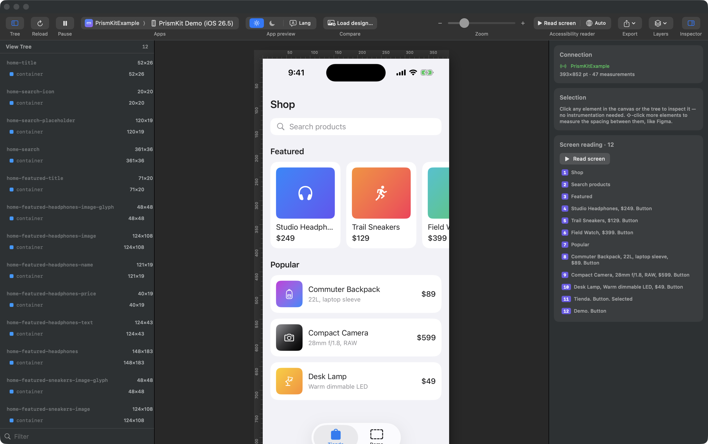
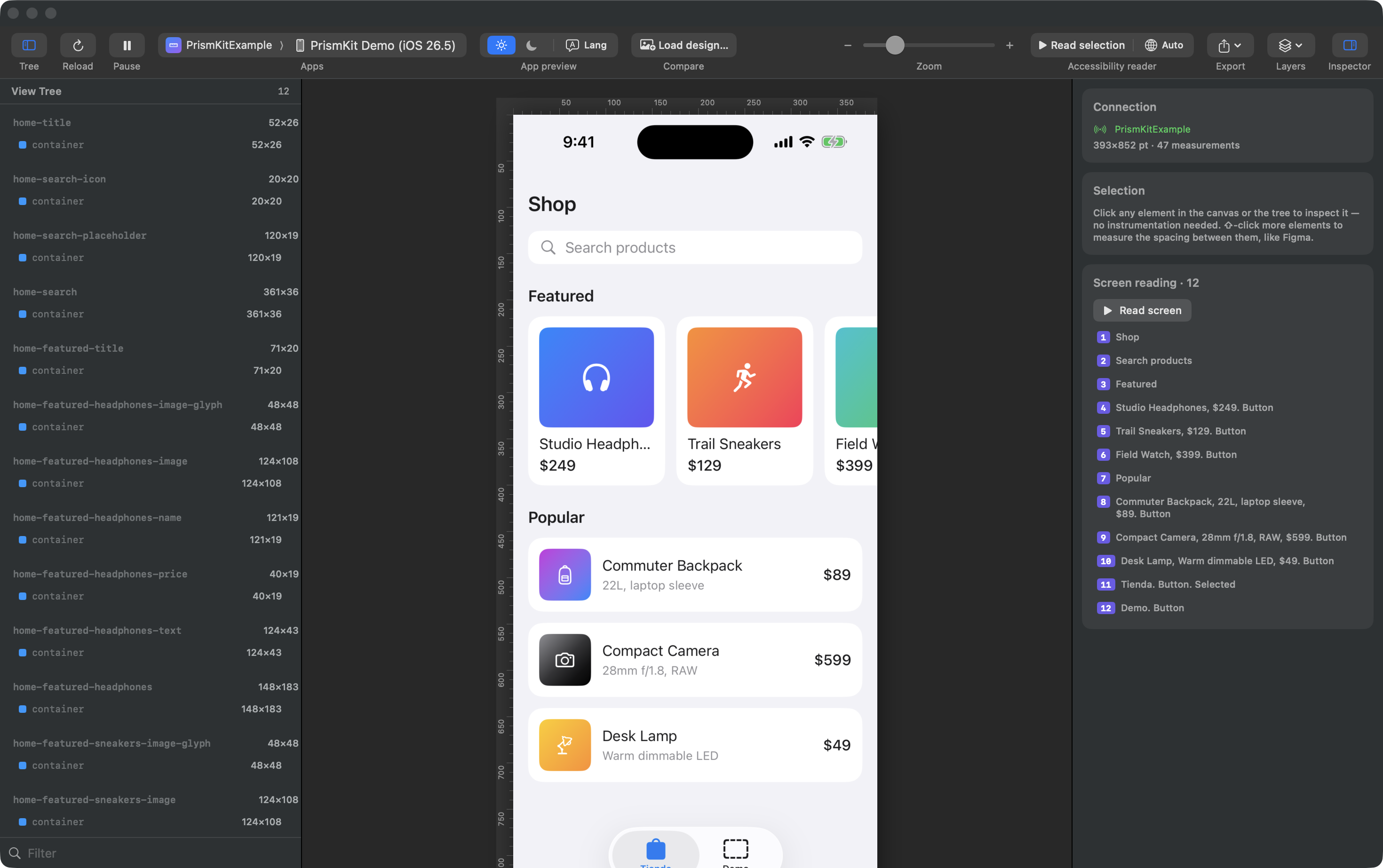
Play the screen back in the order VoiceOver reads it, with each element outlined on the canvas as its announcement is spoken and highlighted in the list.
An unlabelled button stops being something you audit for and becomes something you notice: it is the one that says "Button" and nothing else. Trait words come from the traits SwiftUI already set, so they are what a real user would hear — in the reading language you pick, which is separate from the interface language.
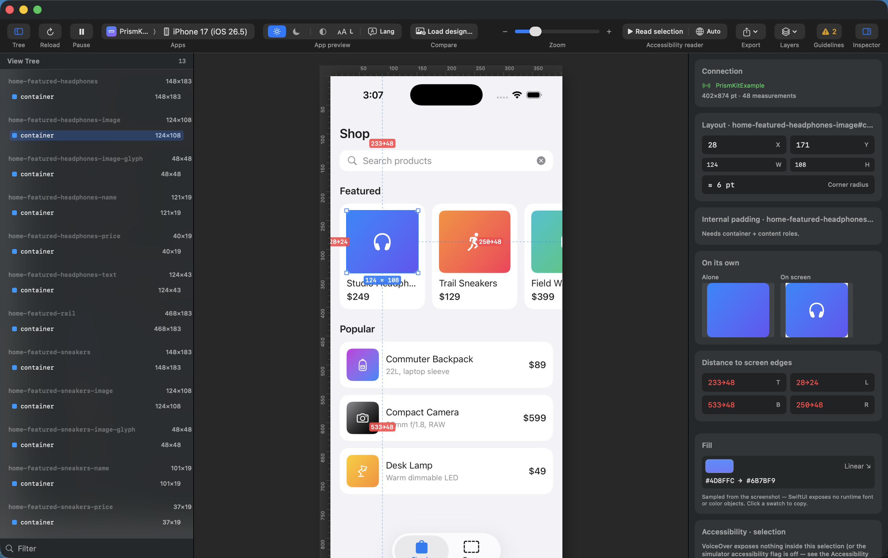
On screen, a component covered by another, one at zero opacity and one with no height all look the same: like nothing at all. They are three different bugs.
Select anything and see it drawn by itself, next to the same patch of the screen. A blank picture is an answer too — it means the component draws nothing and everything you see in it belongs to its children.
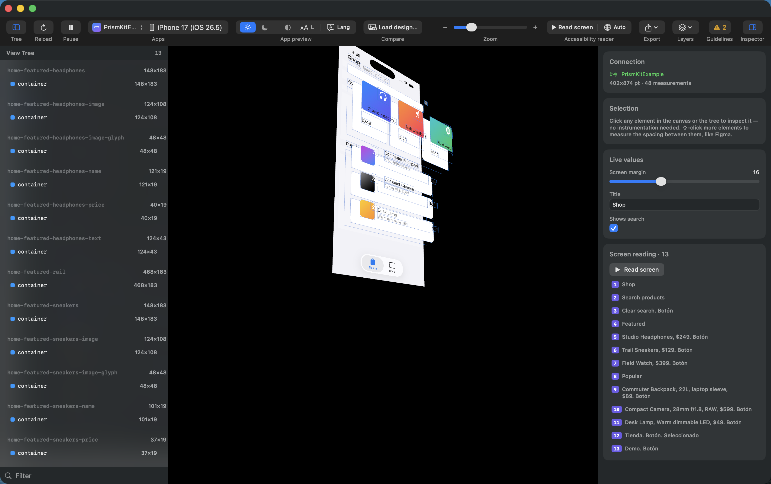
The components stacked in depth by how deeply they are nested, and orbitable. Each plane is drawn without the ones inside it, so a container that only holds other views reads as empty — which is exactly what it contributes.
Crop a flat screenshot instead and every container arrives painted with its children, which stacks into a pile of paper rather than a hierarchy. That is why this is built on renders from the app rather than on the picture.
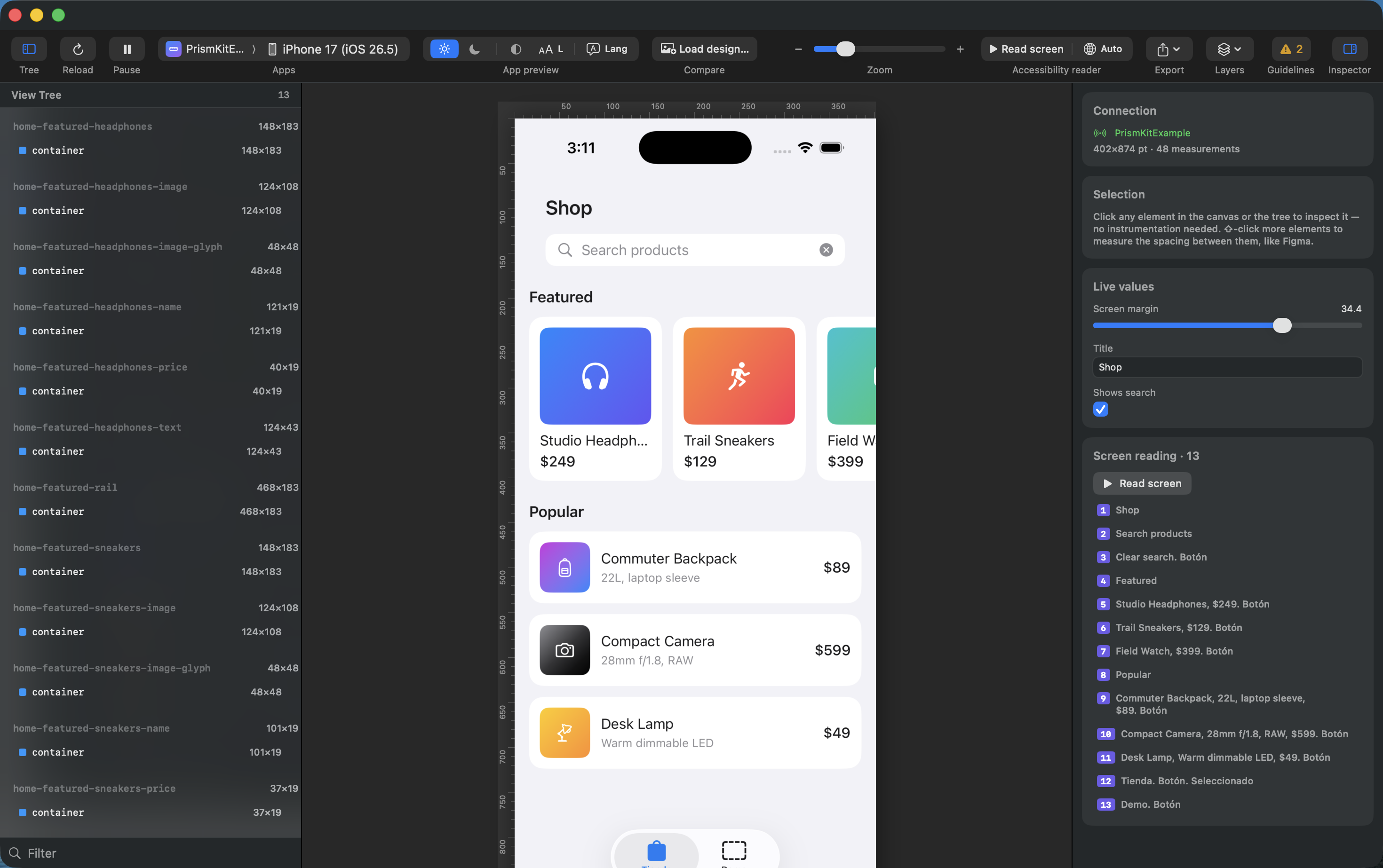
Sizes can be pushed from here into any measured view. For padding, copy and flags the app offers them itself — one modifier hands over the binding it already owns.
The app really re-lays-out: text rewraps, everything below moves, and the measurements follow. It is not a drawing on top of a screenshot.
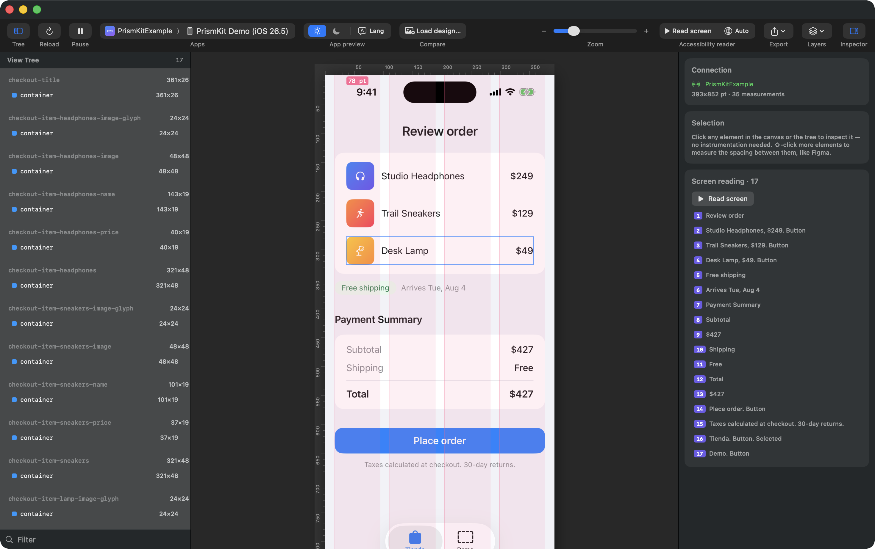
Lay your own columns across the live screen — count, gutter and margin as you set them — with the safe area beside them, at real device size rather than in a mockup.
The spacing is the scale you already committed in .prismkit.json, not a
fixed 8 points. What you eyeball against here is the same number the design check and the
MCP server judge by, so the grid you look at and the grid that fails a review cannot
drift apart.
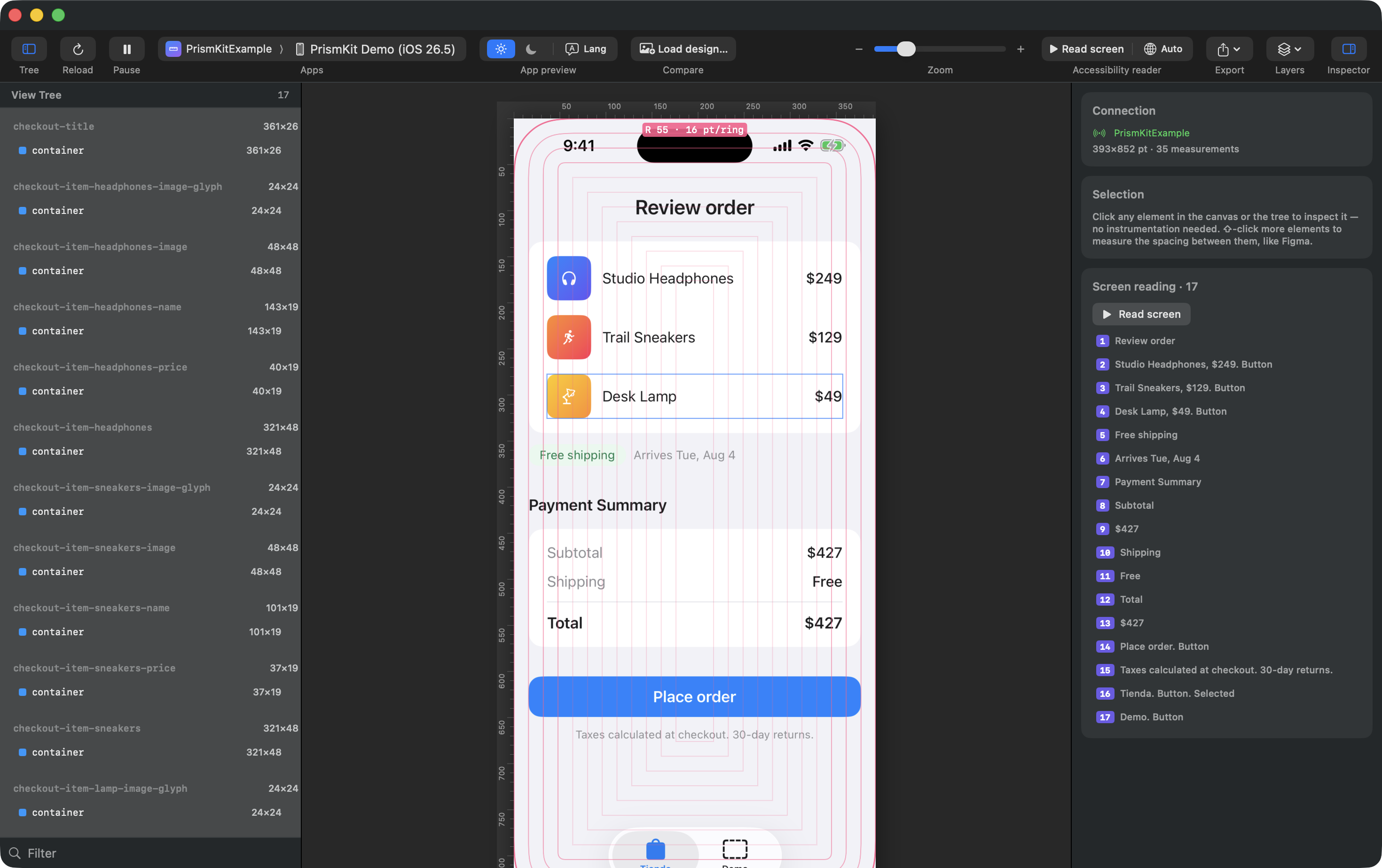
Nested corners look right when their radii step evenly inward from the one the hardware gives you, and wrong in a way most people feel without being able to name. Draw the rings and the corner that drifted stops being a hunch.
The rings start from the device's own radius, read from the simulator rather than guessed at, so they move when you change device instead of quietly describing a phone you stopped designing for.
Paddings and gaps are flagged when they fall off your scale, with the nearest token as
the hint. It lives in a .prismkit.json you commit, so the app, the MCP server
and the whole team judge by the same numbers.
Point it at a running app and inspect the view tree straight away. The SDK is optional — it upgrades readings from UIKit's class names to the component names you chose.
Put a design image beside the running app, overlay it with adjustable opacity, or wipe between the two — with the guides mirrored across both.
Rulers along the top and left; drag out of one to place a guide. Every layer is off by default, so the canvas starts clean and you turn on only what you are looking for.
Export the canvas exactly as you see it at native device scale, or save a session and review it later with the simulator closed.
English, Spanish, Portuguese, Chinese, French and German — interface, help and the accessibility reader.
Four steps and you are measuring. Two of them are in your app: the inspector reads what the SDK streams, so an app without it has nothing to show.
Download the disk image, then drag Prism Inspector into Applications in the Finder. Dragging matters: copied any other way, macOS runs it from a randomised read-only folder and it can never update itself.
In Xcode: File ▸ Add Package
Dependencies… and paste the repository URL. Or in a
Package.swift:
.package(url: "https://github.com/zalazara/PrismKit-SDK.git", from: "0.2.0")It compiles out of release builds entirely — the collection, overlay and
streaming code is not in the shipping binary, so it does not need wrapping in
#if DEBUG.
This is what streams. Nothing else in your app needs annotating:
import PrismKit

var body: some Scene {
    WindowGroup {
        ContentView()
            .measureScope()
    }
}
Put it above your NavigationStack or TabView so every screen
you push is covered by it.
Launch in the simulator from Xcode or simctl, or plug in an iPhone and
run it there — an attached device shows up in the same menu, by name. The inspector finds
the app and mirrors its screen. Click anything to inspect it, ⌥-click a second element to
measure between them.
Order does not matter — start either one first, the app reconnects within a few seconds. If the view tree stays empty, the simulator has not built its accessibility tree yet: the inspector has a button for that, then relaunch the app.
An MCP server ships inside the app bundle, so an agent can read the same measurements you see and report what does not match the design — no separate install, no server to run.
get_measurements, measure_distance, check_alignment
— the numbers, straight from the running screen.attach_design, compare_to_design, detach_design —
hand it a design and get the differences back as structured findings rather than prose.get_design_tokens, set_design_tokens — the same spacing scale
the app judges by.list_simulators, capture_screenshot — for driving the simulator.The design it compares against is a neutral description — a Figma node, a Pencil document or an agent's own words all arrive in the same shape, so nothing here is tied to one design tool.
PrismKit is the Swift package you add to your app when you want measurements named after your components instead of after UIKit's internals.
dependencies: [
    .package(url: "https://github.com/zalazara/PrismKit-SDK.git", from: "0.2.0")
]#if DEBUG, so nothing ships to the App Store and
no user data ever leaves a device.Signed with Developer ID and notarized by Apple. macOS 13 or later.
Download for macOS